Sydney Opera House is a pretty amazing place. But it could have been amazing in one of several different ways. That’s because the famous design we know and love today was chosen from over 200 designs submitted to competition in 1956.
The building as it stands was designed by Jørn Utzon, a Danish architect who mostly worked in Scandinavia. But architects from all over the world sent their own ideas of how they thought the building should look and feel, and many were just as odd as Utzon’s nested concrete shells.
The folks at Budget Direct wondered what we missed when the other competing designs were put aside – and they’ve created this stunningly realistic set of images showing how the Sydney Opera House would look today had Utzon been defeated in the final act!
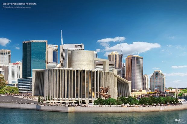
The Philadelphia Collaborative Group’s Wonky Teapot
The American runner-up in the competition had a lot in common with Utzon’s prizewinner – notably, the iconic use of concrete. Created by a team of seven from Philadelphia, the crew came together especially for this project. But some of them stayed together after their near-miss, forming the Brecher Qualls Cunningham (GBQC) firm.
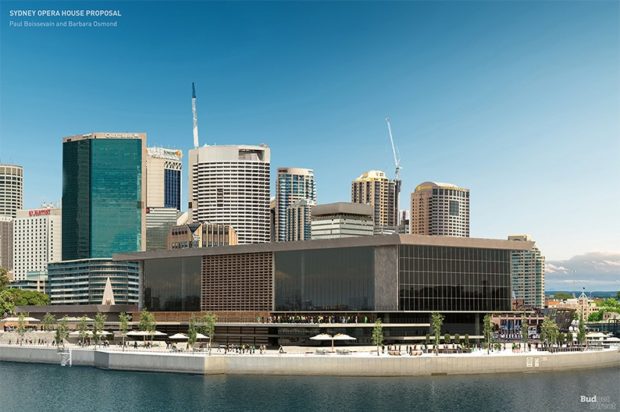
Paul Boissevain and Barbara Osmond’s Shoe Box
Third-place in the Sydney Opera House contest went to this Dutch-British attempt – and judges admitted that it fell down at the last hurdle because it was a bit too conventional-looking. The building was, however, designed on a more ‘human’ scale than the winning entries, which is what kept the judging panel interested.
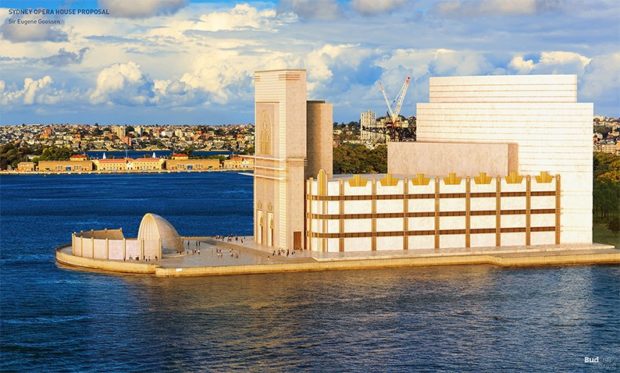
Sir Eugene Goossen’s Cathedral of Sound
Goossen was a music man himself, as conductor of the Sydney Symphony Orchestra and director of the NSW State Conservatorium of Music. In fact, it was Goossen’s suggestion to build an opera house in Sydney in the first place. He drew up his own ideas of what the massive space should look like, although his designs weren’t entered into the competition – and he was forced to leave the country before the final structure was built, due to an unrelated scandal.
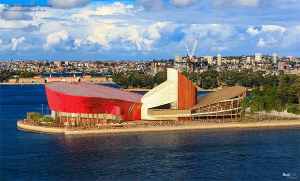
Peter Kollar and Balthazar Korab’s Sloping Trawler
The judges placed this entry, by a pair of Hungarian refugees, in fourth place, impressed as they were with the “skilful planning” of the boat-like structure. Peter Kollar would go on to work alongside Utzon during the early stages of the building, before the winning architect was removed from the project due to a dispute with his bosses.
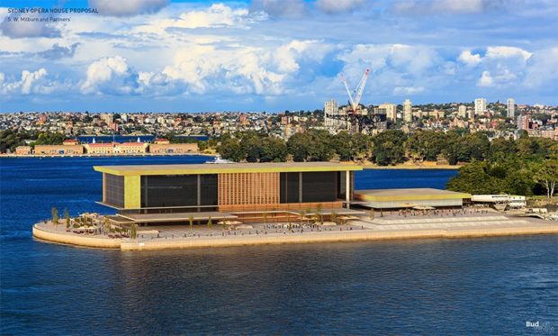
W. Milburn and Partners’ Glass Coffee Table
Designed by Stanley Wayman Milburn and Eric Dow, this boxy effort paid its dues to the common man and the whosits of the art world: a promenade beneath the building invited passers-by to engage with the architecture, while a helicopter port on the roof would have been a convenient landing spot for the glitterati.
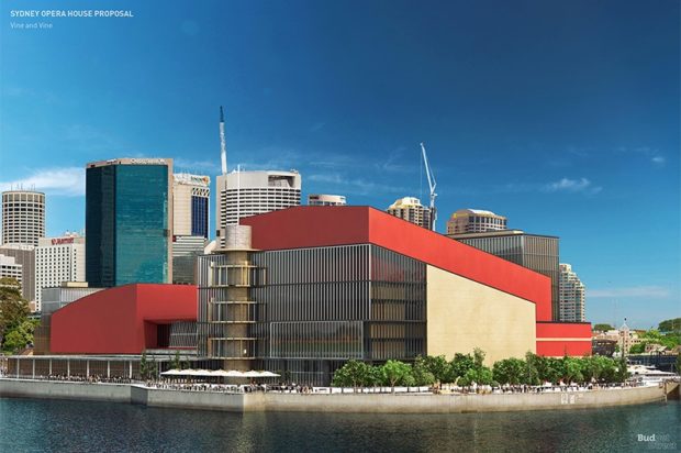
Vine and Vine’s Red Dwarf
This British duo were so ambitious they designed two auditoria to sit side by side, with a restaurant in between and a sunken plaza outside. The red façade may have been ahead of its time, but judges didn’t let it blind them to the fact that they didn’t need a second auditorium.
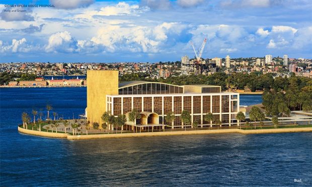
Kelly and Gruzen’s Vegas Hotel
Complementing the area’s palm trees perfectly, this Canadian design had more than a touch of U.S.-style glamour to its façade. But compare it to Utzon’s winning design, and you may come to the conclusion that the contest’s judges just weren’t that into right-angles.
Which potential structures would have tempted you to spend a night at the opera?
The post What the Sydney Opera House could have looked like appeared first on YourAmazingPlaces.com.


No comments:
Post a Comment